Meridian Visual Identity and Logos
Meridian International Center is proud of its reputation as a leading public diplomacy and global leadership organization and the brand recognition it enjoys worldwide. This organization-wide branding policy is a critical image management tool which was designed to ensure the consistent representation of our visual identity in all internal and external communications. The guide includes standards for using our logos, typographic fonts, and color palettes, as well as guidelines around the translation of our organization’s name and the names of our programs, initiatives, and networks.
The following guidelines should be applied to all communications materials, including letterhead, press materials, brochures, marketing materials, publications, posters, advertising (print and electronic), online applications, email messages, signage, and materials for visitor packets (with exceptions for the IVLP that affect PED’s compliance with U.S. State Department guidelines).
The Meridian Communications and Marketing Department is responsible for maintaining and enforcing Meridian's Visual Identity Standards and Brand Guidelines. Our team can advise you on ensuring your materials adhere.
Questions? Email communications@meridian.org Download the Meridian Brand Cheat Sheet
Official Meridian Logos
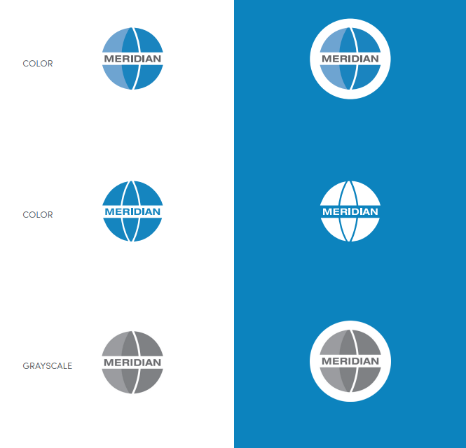 The following logos are intended for use in all display applications, from posters to websites to stationery. Under no circumstances should the artwork ever be altered, added to, or re-created. You may use the primary or secondary Meridian logo depending on the medium, message, and audience. You may not use more than one same logo option in the same design space, such as on the same page of print communication.
Primary Meridian Logo
The primary logo is always the preferred identity variation used in all display applications, including posters, advertisements, promotional materials, and websites. The primary logo is a segmented blue circle divided by a curved white line meant to evoke the global nature of Meridian’s work, history, and mission statement. To ensure that we maximize legibility, it is important that our logo is never used below the minimum sizes (175px by 175px / 0.74 in by 0.75 in).
If you cannot use the primary color version of our logo, either due to the need for increased contrast or a limited color palette, there are two additional versions available for organization-wide usage. Please refer to the logos and color variations pages for guidance on contrasting the available logo versions and backgrounds. To ensure readability on digital screens and print material, the logo and background must have a high level of contrast. In all communications, the logo must have a minimum clear space that equals 133% on all sides.
For use on colored or dark backgrounds. In cases where a colored background is too light for adequate contrast, the primary version of the logo should be used with the white clear space border.
Download Full White (Reversse) Logo Files
Secondary Meridian Logo
In some select instances, the secondary version of our logo may be required, which is solely the word-type from our primary logo. The secondary logo may be used in instances where space is prohibitive. Additional color variations are available for use cases where more contrast is required or when color use is limited. Secondary logo minimum size (50 px tall / 0.25 in tall).
Fonts and Typefaces
Our house typography system is designed to create a high degree of contrast between individual segments of text as well as maximum readiblity. While there are use cases that create exceptions, please consult
communications if you plan make alterations.
Headline Lockups
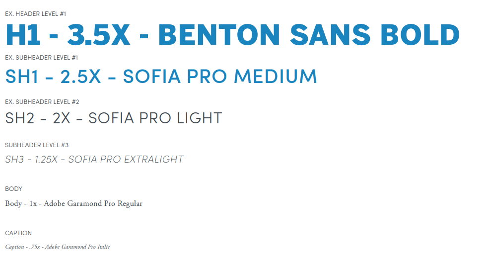
Rules at a glance
- Benton Sans is always used for titles.
- Benton Sans is always in all caps.
- Sofia Pro is always used for subtitles.
- Sofia Pro may be used in either standard capitalization or all caps.
- Adobe Garamond Pro is always used for body text.
- Adobe Garamond Pro is always in grayscale.
- Don't use unapproved fonts.
- Don't add effects like drop shadows or gradients.
- Don't use unapproved colors.
- Don't use justified text.
- Don't use outlining or underlining.
- Don't place it against a background that reduces legibility.
Benton Sans is a modern sans serif typeface in a grotesque style created for use cases in organizational and corporate branding. With its mostly uniform stroke width, compact character sets, and open apertures, Benton Sans is designed for maximum legibility and a friendly but clean appearance. Benton Sans is used for headlines and titles as part of our house font system.
Sofia Pro is a geometric modern sans serif font. The uniform stroke width, straight ascender, and descenders, and circular titles communicate sophistication while maintaining a high degree of readability. With wider, rounder apertures than Benton Sans, Sofia Pro is used for subtitles to create a subtle contrast between the subtitle and title. Due to its wide-open characters, Sofia Pro is also used for text within graphics and some photograph captions.
Dating back to 1495, the Garamond font family is one of the oldest typefaces, although adapted for various modern use cases. A serif font designed for large compact blocks of text, Adobe Garamond Pro uses elements from the original Garamond font family with changes for optimal readability at smaller sizes and updated italics options. Matched with our sans serif fonts in titles and subtitles, Adobe Garamond creates a high degree
of contrast in body text, endnotes, footnotes, and captions as part of our house-type system
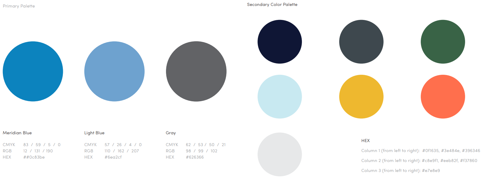
Color Palette
Meridian's color palette is a highly visible and expressive component of our identity. The palette includes primary, and secondary colors to help you communicate your message and add variety. The secondary color palette provides a wider range of secondary colors for various events and initiatives and accent colors. Each color here compliments the core set of blues. They are a range of colors that pop and colors that sit well as a strong base.
Primary Palette
Meridian Blue
- CMYK 83 / 59 / 5 / 0
- RGB 12 / 131 / 190
- Hex #0c83be
Light Blue
- CMYK 57 / 26 / 4 / 0
- RGB 110 / 162 / 207
- Hex #6ea2cf
Gray
- CMYK 62 / 53 / 50 / 21
- RGB 98 / 99 / 102
- Hex #626366
Full Primary and Secondary Palette
Imagery and Photo Use
Meridian’s incredible events and programs are documented with high-quality photographs by professional photographers. Please refer to our extensive photography archives first to find the ideal photograph for your product or project. Stock photography is acceptable if you cannot find a photograph that fits your needs. Please do not use illustrations except for the commissioned illustrations of Meridian’s campus. Please contact communications if you have difficulty finding the correct imagery for your project.
What to Avoid
- Don't use illustrations.
- Don't use low-resolution or low-quality photographs.
- Don't add gradients.
- Don't stretch or warp a photograph.
- Don't use drop shadows or other effects.
- Don't use photographs as a background that will reduce text legibility.